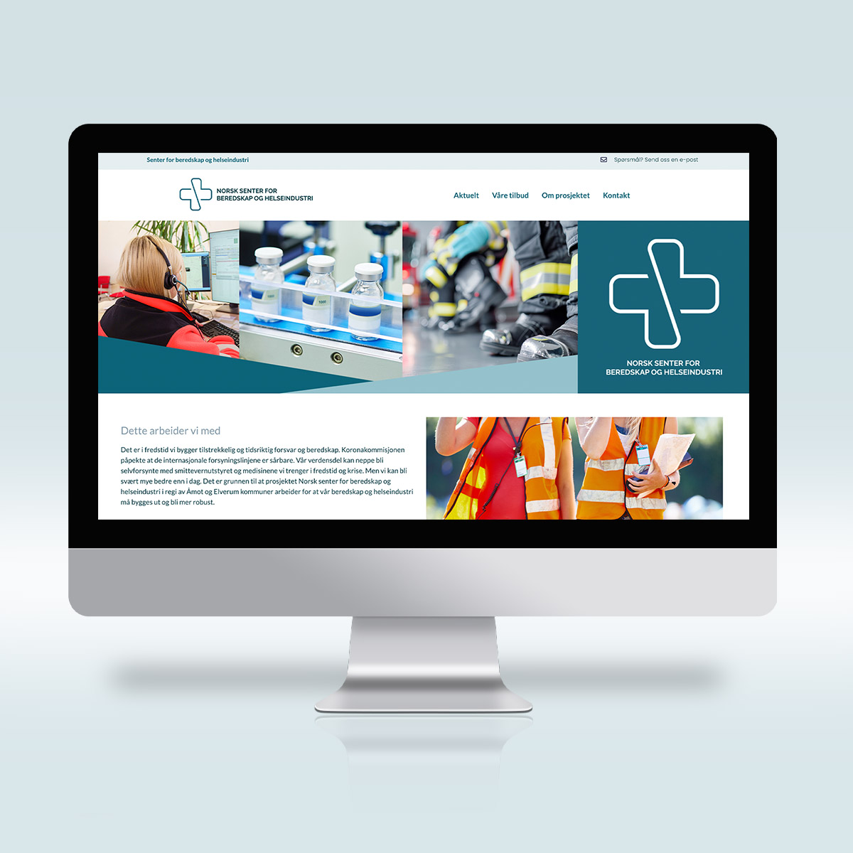
For the Norwegian Centre for Emergency Preparedness and Health Industry, I had the pleasure of developing the logo, color palette, and website.
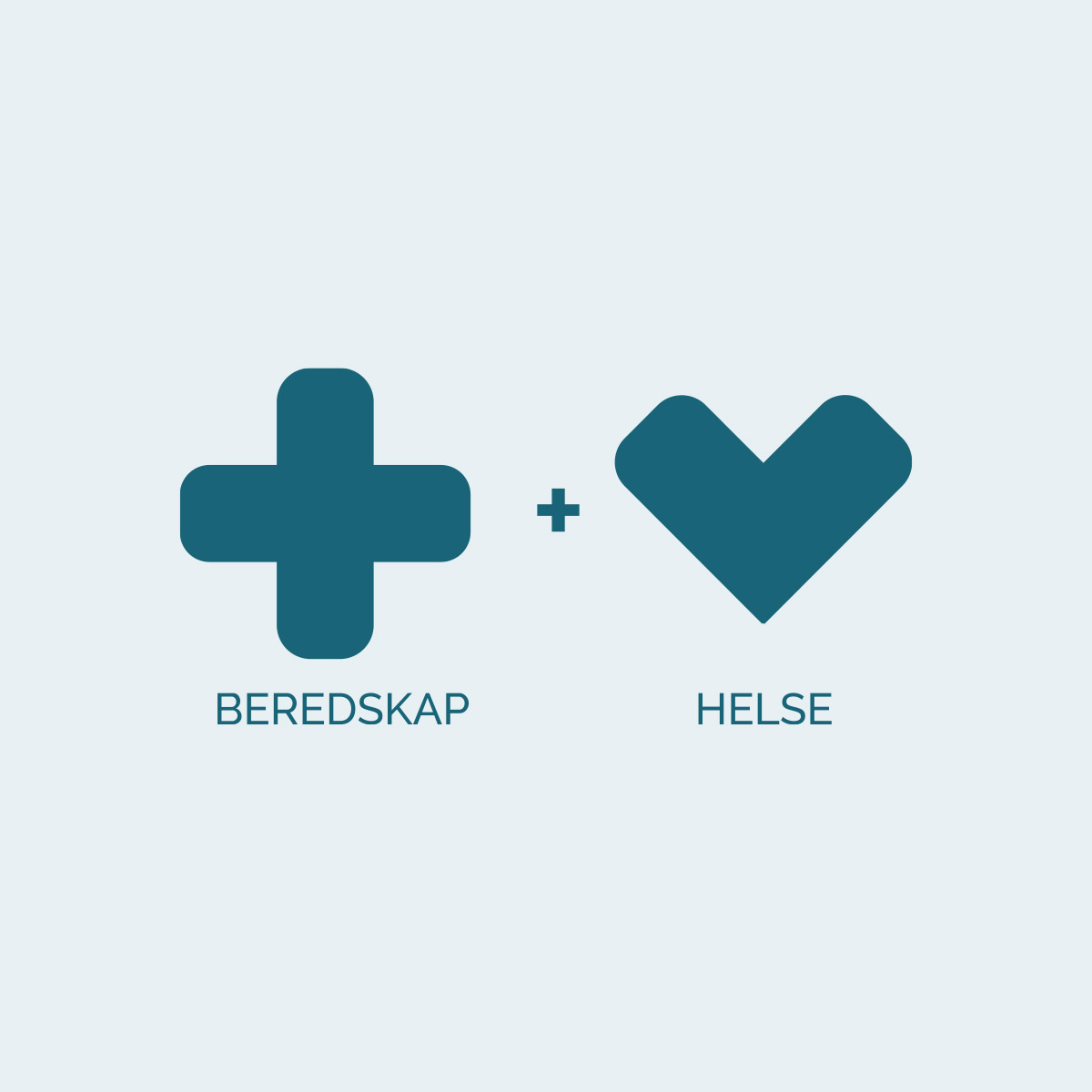
The logo is carefully designed to symbolize the project’s core values. It combines a cross, representing emergency preparedness, with a heart symbolizing health. The form brings these elements together to illustrate how health and preparedness are interconnected, and how they form a strong foundation that must be built together for a safer future.
The project focuses on strengthening Norway’s ability to handle crisis situations by ensuring access to protective equipment and essential medicines—an increasingly important task in a world with vulnerable supply chains.
The website was created in collaboration with Siv Lillevik from Pixlweb, and together we created a solution that is both clear and informative. I’m proud to have contributed to such a meaningful project.


