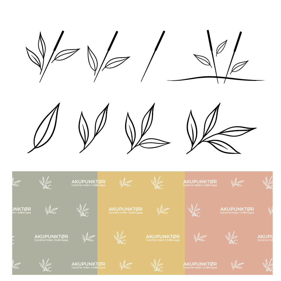
Caroline came to me with a simple sketch created by her daughter, with the wish to use it as a starting point for developing a cohesive visual identity for her acupuncture practice. The goal was to create a visual expression that reflects her work with balancing the body’s energy through acupuncture, with nature as a key source of inspiration.
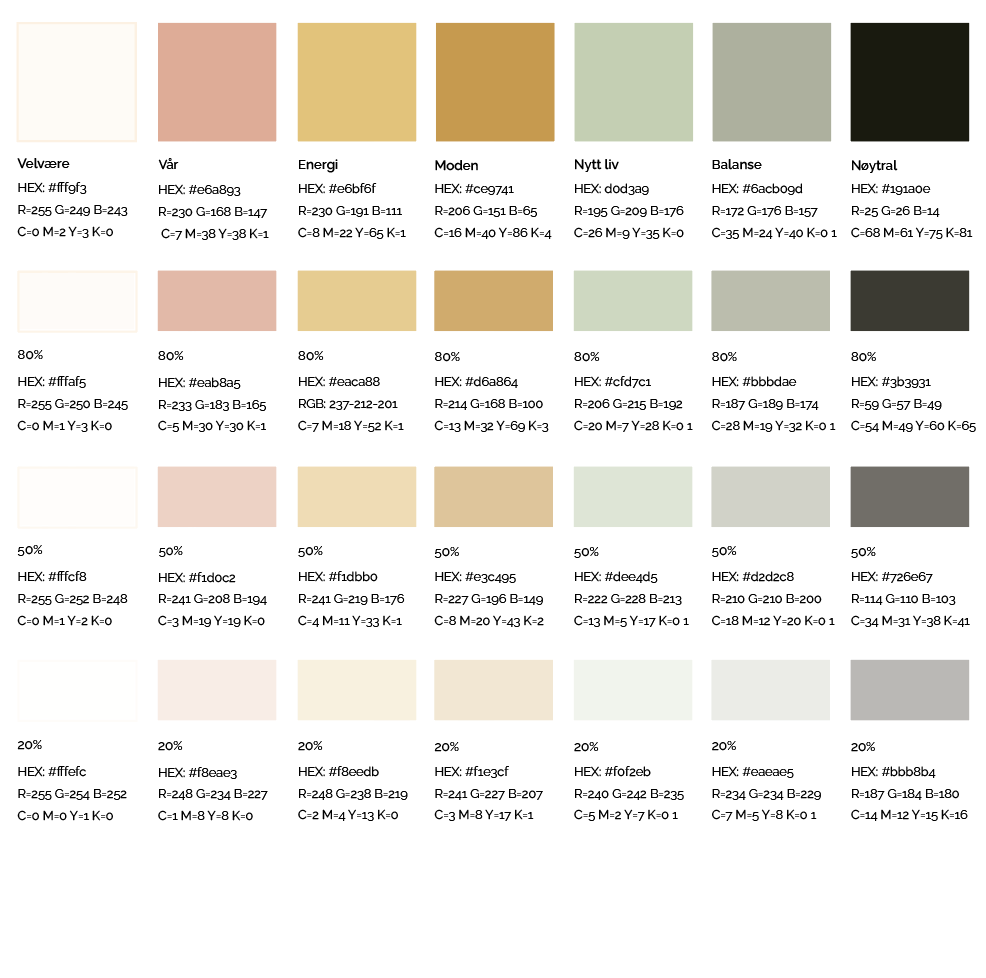
The color palette is carefully curated to communicate calm, well-being, and natural energy. Light, earthy tones symbolize the healing and soothing effects of acupuncture, while green elements bring nature into the identity as a symbol of renewal, energy, and balance.
The logo and accompanying icons were designed with a focus on simplicity and elegance, with the acupuncture needle integrated into the name and the leaves symbolizing the flow of energy. Together, these elements create a harmonious visual identity that resonates with Caroline’s philosophy and gives her practice a professional and trustworthy expression.
The visual identity was developed with flexibility in mind, ensuring it works just as well digitally as in print, and giving Caroline a clear and recognizable presence across all channels.

