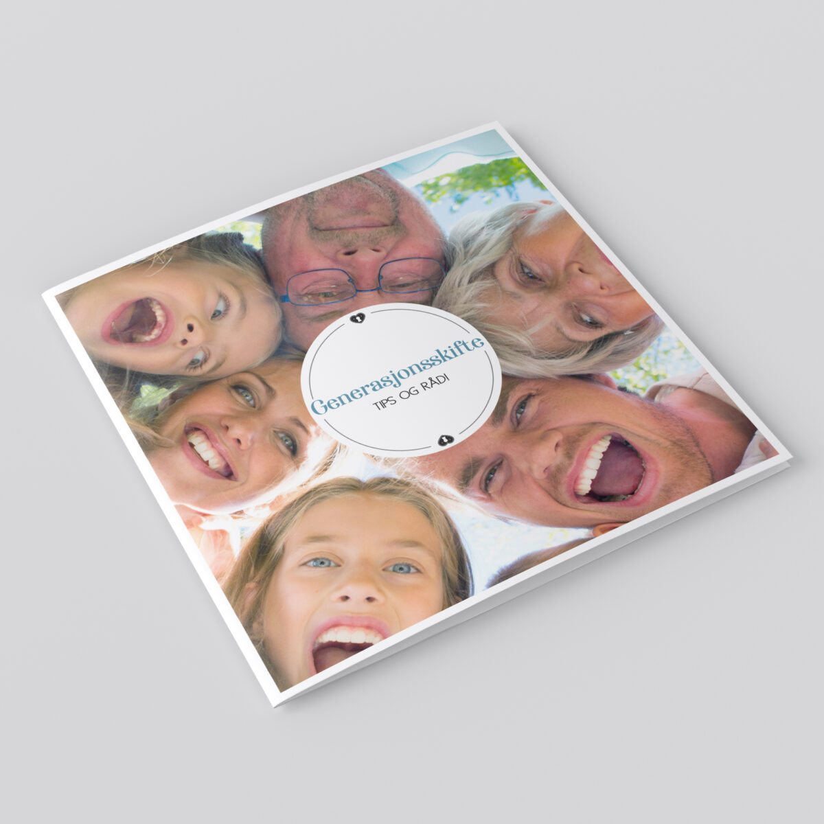
ILLUSTRATIONS FOR THE ELVERUM BOARD GAME

For the Elverum board game, I have had the pleasure of illustrating a unique game board that represents the city's culture and business life. In this project, I have combined traditional watercolor techniques with modern digital drawing in Procreate, which has resulted in a colorful and detailed map of Elverum. In addition to the map itself, the game board also has illustrations of landmarks, elements and buildings that characterize the city.

The Elverum game follows a Monopoly-like model, where players can buy shares in local businesses. This promotes the city's businesses, and also contributes to a unique gaming experience that is directly linked to Elverum. The game is available for purchase at Elverum Turn.

This project is part of a larger initiative where local illustrators and artists are engaged to design game boards for different cities and local businesses are encouraged to buy space on the game board, with the aim of supporting local activities for children and teenagers through the sale of the games.

MAP & FOLDER FOR ELVERUM VEKST

In this illustration and design project for Elverum Vekst, the goal was to highlight Elverum as an attractive city to live, experience and work in, especially aimed at an international audience at a fair in the Netherlands. To achieve this goal, I designed a range of visual material that both informs and engages.

The project included an illustration of a map of Elverum, designed to focus on the city's residential areas, workplaces and attractions. Each category: Live, Experience and Work were marked with various illustrations for easy navigation and understanding. The map was integrated into a leaflet that was distributed at the fair.

I also developed a roll-up and T-shirt with an illustration that complements the other material.

The material is tailored to make Elverum an interesting choice for an international audience, with a clear message about the city's many possibilities for a rich and balanced life.

POSTER & SOME CONTENT FAGFORBUNDET

In this project, I've had the pleasure of working together with the Trade Union to create engaging and informative material for their upcoming members' evening in Elverum. The task was to lift the message beyond the traditional A4 sheet designed in Word, and really capture the essence of the Trade Union's brand.

By using the Trade Union's profile colors and visual elements, I have designed a poster that both captures attention and communicates important information in a clear and effective way. To reinforce the message further on social media, I have also designed a seamless Instagram carousel post, consisting of three images. These images flow naturally into each other and offer information about the event, which ensures a coherent and visual narrative.

The aim of this design was to create a sense of community and belonging, while at the same time informing members about the exciting agenda for the evening.

REPEAT PATTERN FOR CURTAINS MOELVEN

In collaboration with Fugleperspektivet interior architects, I had the pleasure of designing a repeat pattern for curtains that were going to be used in Moelven's reception and offices at Østerdalsbruket. The project focused on reflecting Moelven's identity as a leading player in the wood-industry in Scandinavia. The pattern is inspired by the lines of wood, designed in the company's profile color to strengthen the brand identity.

The design process started with analog methods; I used paint, brushes, paper and pen to create an organic and authentic expression that could truly represent Moelven's nature-based identity. The curtains are produced in linen, a natural material that resonates with Moelven's sustainable philosophy, and were woven at a linen weaving mill in Sweden.

This project not only shows a strong connection between functional and aesthetic design, but also how a well-thought-out interior can help reinforce a company's overall branding strategy.

BRANDING AND LOGO HOVDAL GÅRD

On this project project, I worked closely with both the web developer Siv Lillevik and an interiourarchitect. The client wanted of total renovation of their farm buildings, photographs, design profile and website. I developed the design profile with a logo for both printed and digital surfaces, as well as the visuals of their website. An important part of this work was to design a color palette that could reflect the farm's natural surroundings and at the same time highlight its recreational facilities.

The color palette was developed in collaboration with the interiorarchitect, and many of the colors we chose were used on the farm's recreational facilities. For the graphic profile I chose green natural tones to reflect the surrounding nature, combined with warm and safe ocher and maroon shades. These colors not only create a visual harmony in the design profile, but also link the farm's visual identity with its physical surroundings.

PATTERNS & ILLUSTRATIONS - SNOWMAN

This mini-collection is designed with a selected color palette and idea. The process started with sketching by hand in my sketchbook. From them I selected a snowman and idea to work on.

The sketch was further developed and drawn in Procreate. This snowman is made in several layers so it is easy to change colors and other details.

After I finished the illustration, I began sketching and design patterns that could fit the theme.

MAP & ILLUSTRATIONS ELVERUM HØYRE

For the political party Elverum Høyre, I illustrated a map of Elverum with illustrations to visually present the opportunities for development that exist in Elverum, as well as emphasize in which ways Elverum is and can become an ev en more safe place to live, grow up and work.

The first phase of the project was an idea- and brainstorming where Elverum Høyre presented its ideas. Furthermore, I developed a sketch which we worked on until we landed the right expression.

In addition to the map, I drew individual illustrations that were used in Elverum Høyre's election program to emphasize the message.

Maps and illustrations were also used for their campaign marketing materials such as roll-ups, posters, tote bags and t-shirts.

Marketing content for Facebook and their website was also designed, in line with Høyre's design profile.