BRANDING AND WEBDESIGN

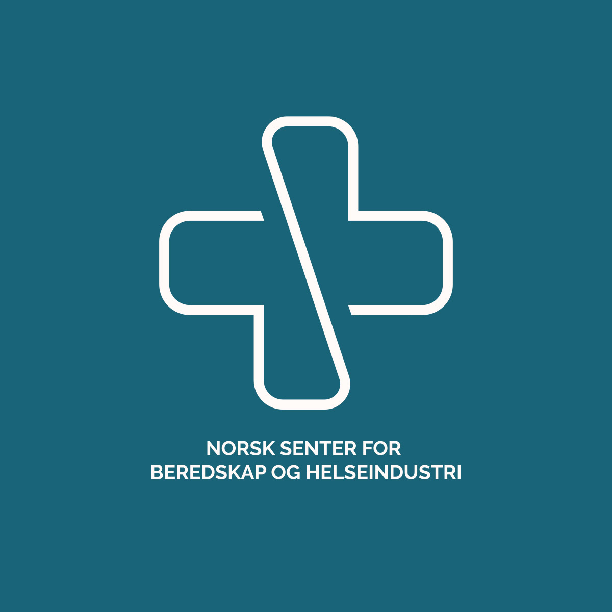
For the Norwegian Center for Emergency and Health Industry, I have had the pleasure of developing the logo, color palette and website.

The logo has been carefully designed to symbolize the project's core values. It combines a cross, which represents the emergency services, and a heart, which symbolizes health. The logoshape ties these two elements together to show that health and the emergency services are linked together and that there is a solid foundation that we must build together for a safer future.

The project is about strengthening Norway's ability to better handle crisis situations by ensuring access to infection control equipment and medicines, a task that is becoming increasingly important in a world with vulnerable supply lines.

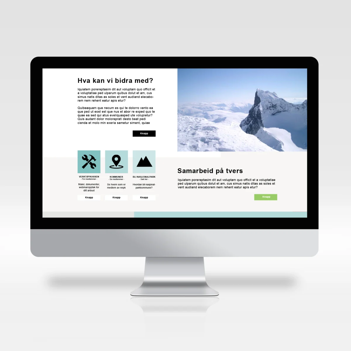
The website was created in collaboration with Siv Lillevik from Pixlweband together we created a solution that is both clear and informative. I am proud to have contributed to such a meaningful project.

DESIGNPROFIL FOR AKUPUNKTØR CAROLINE HOLEN ULVÅKNIPPA

Caroline kom til meg med en enkel skisse laget av hennes datter, med et ønske om å bruke den som utgangspunkt og utvikle en helhetlig designprofil for hennes akupunktørpraksis. Målet var å skape en visuell identitet som reflekterer hennes arbeid med å balansere kroppens energi gjennom akupunktur, med naturen som en sentral inspirasjonskilde.

Fargepaletten er nøye satt sammen for å kommunisere ro, velvære og naturlig energi. De lyse, jordnære tonene symboliserer den helbredende og beroligende effekten akupunktur har, mens de grønne elementene trekker naturen inn som et symbol på fornyelse, energi og balanse.

Logoen og de tilhørende ikoner ble designet med fokus på enkelhet og eleganse, der akupunkturnålen integreres som en del av navnet og bladene symboliserer energistrømmen. Helheten skaper en harmonisk visuell identitet som resonnerer med Carolines filosofi og gir hennes praksis et profesjonelt og troverdig uttrykk.

Designprofilen er utviklet med fleksibilitet i tankene, slik at den fungerer like godt digitalt som på trykk, og gir Caroline en tydelig og gjenkjennbar tilstedeværelse i alle kanaler.

FEATURED WEBSITE DESIGNS

This page of my portfolio shows a selection of my web design projects, where I have had the visual responsibility. Most of the websites I have designed have been developed in collaboration with the development company Pixlweb. This collaboration ensures that the websites are not only aesthetically pleasing, but also technically robust and functional.

My projects range from simple informational pages to complex e-commerce solutions, all designed with a focus on ease of use and effective branding. I have experience in creating responsive design that improves the user experience and optimizes the customer's digital presence.

LOGOS MADE FOR SEVERAL CLIENTS

This page gives a small overview of some of the various logos I have designed. Each logo is designed with a good understanding of the brand's/company's needs and target audience, and demonstrates my ability to develop visual identities that are both aesthetically pleasing and strategic.

My projects are made for different industries and contain elements adapted to each customer's unique character, needs and market. This selection shows some of the breadth of my design expertise and approach to logo design.

BEER BOTTLES LABELS FOR SOBEER

For Sobeer "mini brewery" I designed a series of labels adapted to three different types of beer as well as a cider. The aim was to create a visual system that distinguishes the products from each other and maintains a uniform brand expression. Each label is designed to represent the individual characteristics of each type of drink: IPA, Weissbier, Lager and Cider.

The typography balances modern and traditional elements and the graphic element of a crown above the brand name 'Sobeer' reinforces the feeling of quality and creates a visual connection to the brewery's location, standard of craftsmanship and taste.

WEBSITE FOR PIANOVERKSTEDET HOLTHE & BAKKE

The client has long been recognized for its craftsmanship and expertise in piano repairs and maintenance. Wanting to improve their digital presence, they approached me to develop an online store that reflects their quality and professional pride.

In collaboration with Siv in Pixlweb, we designed and developed a tailored e-commerce solution for the client. The website integrates the company's existing visual profile to ensure recognition and brand consistency. We implemented user-friendly features and custom filters that allow customers to easily navigate through a wide selection of products based on category, price, condition and other relevant specifications.

The new online store now functions as an extension of Pianoverkstedet Holthe og Bakke's physical operations. The website appears both professional and user-friendly, and reinforces the brand's reputation by offering an efficient online shopping experience.

Take a look at the page at www.pianoverkstedet.com

BRANDING FOR MAUDS MANUFAKTUR

In my collaboration with Mauds Manufaktur, I have developed a visual profile that complements the brand's existing logo. Mauds Manufaktur is a Norwegian brand that supplies knitting accessories. This new graphic profile is inspired by Queen Maud and her historical and cultural significance, and it reflects the values ​​of Mauds Manufaktur in a good way.

The project included the development of a color palette that reflects the values: Quality, Inspiring, Sophisticated and Down to Earth. The color choices are varied, from deep, earthy tones to lighter, more airy shades, which together create a balanced and appealing aesthetic.

As part of the branding, I also designed trade show materials and their B2B online store. These elements are created to support the brand's presence both digitally and in physical environments, and to provide a holistic user experience across all platforms. This means that Mauds Manufaktur appears both modern and timeless, with a strong anchoring in its core values.

Also take a look at illustrations made for Mauds Manufaktur

GRAPHIC MATERIALS FOR TINKAFU

In my involvement with Tinkafu, I have had the opportunity to work broadly with graphic design and visual communication, adapted the company's visual profile and brand values. My responsibilities have covered, among other things, the design of a range of graphic materials, including product catalogues, exhibition materials, mailer inserts, banners for the website, and content for newsletters.

In addition to these tasks, I have also developed social media posts and animated GIFs to strengthen Tinkafu's digital presence.

Every design element has been created to be in line with Tinkafu's visual identity and to appeal to their target audience of young families looking for functional stroller accessories that lasts for a long time.

RENDERING OF LOGO FOR FRIHEST

In this project, I have had the pleasure of working with Matilde Brandt in Frihest to draw and further develop a logo, based on her original sketches. The logo's design has been carefully crafted to reflect her approach and philosophy around freedom dressage and intuitive communication with horses.

The logo's graphic expression combines the elegance and strength of a horse with sensitive and flowing lines, which symbolizes freedom and harmony between horse and rider. "Frihest" is integrated in a way that balances visually with the logo element, and creates a clear and recognizable identity for Matilde's business.

The goal of the design process was to create a logo that both reflects Frihest's commitment to the horse's welfare and their unique approach to training. The result is a visual identity that communicates values ​​of trust, respect and playful learning in working with horses.

WEBSITE DESIGN FOR NORGES NASJONALPARKKOMMUNER

In this project, I have designed a website for Norway's national park municipalities, an association that focuses on local values and business development through their brand. The website functions as an important work tool as well as a presentation of the 24 national park municipalities and 5 national park towns, which together form an important part of Norway's natural heritage and local economic development.

The website has been designed in line with the association's design manual, and with a strong focus on user-friendliness. The visual expression has been created to reflect the association's professionalism and its connection to the scenic surroundings of Norway's national parks. My role in the project was to design the visual expression, while technical development and implementation was handled by Pixlweb.

The goal with this design was to create an intuitive and informative user experience that not only highlights each municipality's unique characteristics, but also promotes the association's overall goal of supporting local economic growth and community development through nature-based experiences.