LOGOS FOR VARIOUS CLIENTS

This page offers a brief overview of some of the logos I’ve designed. Each logo is created with a clear understanding of the brand’s needs and target audience, and reflects my ability to develop visual identities that are both aesthetically pleasing and strategically sound.

My projects span a variety of industries and include elements tailored to each client’s unique character, needs, and market. This selection highlights the range of my design expertise and my approach to logo design.

LABELS FOR BEER BOTTLES FOR SOBEER

For Sobeer microbrewery, I designed a series of labels tailored to three different beer styles as well as a cider. The goal was to create a visual system that clearly differentiates each product while maintaining a cohesive brand identity. Each label is designed to reflect the individual characteristics of the beverages: IPA, Weissbier, Lager, and Cider.

The typography balances modern and traditional elements, while the graphic crown placed above the name “Sobeer” enhances the sense of quality and creates a visual connection to the brewery’s location, craftsmanship, and taste.

WEBDESIGN FOR PIANOVERKSTEDET HOLTHE & BAKKE

Holthe og Bakke Piano Workshop is well known for its craftsmanship and expertise in piano repair and maintenance. Wanting to enhance their digital presence, they reached out to me to create a webshop that reflects their high quality and professional pride.

In collaboration with Siv in Pixlwebwe designed and developed a custom e-commerce solution for Pianoverkstedet Holthe og Bakke. The website integrates the company’s existing visual identity to ensure brand recognition and consistency. We implemented user-friendly features and custom filters, allowing customers to easily navigate a wide range of products by category, price, condition, and other relevant specifications.

The new webshop now functions as an extension of Pianoverkstedet Holthe og Bakke’s physical business. The website feels both professional and user-friendly, strengthening the brand’s reputation by offering an efficient and seamless online shopping experience.

Look at the webpage: www.pianoverkstedet.com

HAPPY CLOUDS PATTERN DESIGN

Happy Clouds is a playful mini collection inspired by Scandinavian summer and nature. The collection features a series of clouds, flowers, and natural elements, presented in a refined color palette of dusty pink, ochre, and shades of blue. The design blends Scandinavian aesthetics with a sense of calm and joy found in nature, making it well suited for everyday products.

This is a personal project, and the collection has been produced across a range of products, including enamel mugs, coasters, kitchen towels, placemats, cutting boards, and gift wrap.

The Happy Clouds collection is available for licensing and full buyout.

LITTLE GARDENER PATTERN DESIGN

The Little Gardener collection is designed with children and the joy of gardening in mind. The project brings together colorful garden and nature-inspired elements such as flowers, strawberries, animals, and clouds, all illustrated in a playful style. The clouds featuring the word “grow” add a gentle educational element, encouraging children to think about growth and nature.

The color palette is bright and playful, combining soft pastels with more saturated tones, making the designs perfect for children’s clothing and other kids’ products. This makes the patterns ideal for a wide range of items, from apparel to accessories such as gardening tools, backpacks, small bags, and notebooks.

Little Gardener is available for licensing or purchase.

ILLUSTRATIONS FOR TOTEBAGS - MAUDS MANUFAKTUR

In this project, I had the pleasure of working with Mauds Manufaktur to create a series of unique project bags featuring illustrations based on historical photographs of Queen Maud. Each bag includes imagery of Queen Maud, combined with the text “queen of her own life” and elements inspired by knitting. The illustrations connect her historical significance with the craft and artistry of handcraft.

The illustrations are created using a hand-drawn, artistic approach, with knitting elements seamlessly integrated into the photographs.

The tote bags, available in two sizes, are not only practical for all types of knitting projects and storing craft supplies, but also work beautifully as stylish accessories.

Take a look at the visual design and webshop designed for Mauds Manufaktur

VISUAL IDENTITY FOR MAUDS MANUFAKTUR

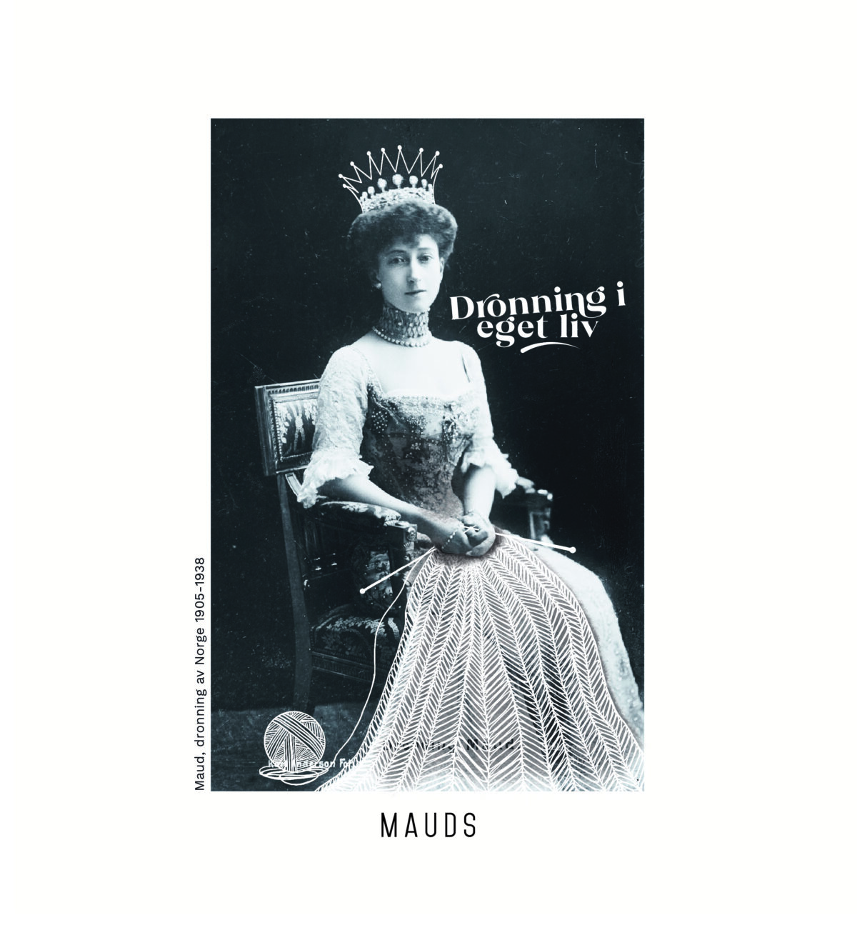
In my collaboration with Mauds Manufaktur, I developed a visual profile that complements the brand’s existing logo. Mauds Manufaktur is a Norwegian brand specializing in knitting accessories. The new visual identity is inspired by Queen Maud and her historical and cultural significance, and reflects the core values of Mauds Manufaktur in a thoughtful and cohesive way.

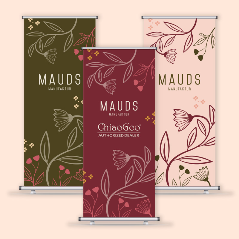
The project included the development of a color palette reflecting the brand values of quality, inspiration, sophistication, and groundedness. The palette ranges from deep, earthy tones to lighter, more airy shades, coming together to create a balanced and appealing aesthetic.

As part of the visual identity, I also designed trade fair materials and Mauds Manufaktur’s B2B webshop. These elements were created to support the brand’s presence both digitally and in physical settings, ensuring a cohesive user experience across all touchpoints. The result positions Mauds Manufaktur as both modern and timeless, with a strong connection to its core values.

Take a look at the Illustrations made for Mauds Manufaktur

GRAPHIC DESIGN FOR TINKAFU

n my collaboration with Tinkafu, I had the opportunity to work broadly with graphic design and visual communication, aligned with the company’s visual identity and brand values. My responsibilities included the design of a wide range of graphic materials, such as product catalogs, trade fair materials, package inserts, website banners, and newsletter content.

In addition to these tasks, I also developed social media posts and animated GIFs to strengthen Tinkafu’s digital presence.

Each design element was carefully created to align with Tinkafu’s visual identity and to appeal to their target audience of young families looking for functional, long-lasting stroller accessories.

LOGO REFINEMENT FOR FRIHEST

In this project, I had the pleasure of working with Matilde Brandt of Frihest to refine and further develop a logo based on her original sketches. The final logo was carefully crafted to reflect her approach and philosophy of liberty training and intuitive communication with horses.

The logo’s visual expression combines the elegance and strength of a horse with soft, flowing lines, symbolizing freedom and harmony between horse and rider. The name “Frihest” is integrated in a way that visually balances the symbol, creating a clear and recognizable identity for Matilde’s business.

The aim of the design process was to create a logo that reflects Frihest’s dedication to horse welfare and their distinctive approach to training, resulting in an identity built on trust, respect, and playful learning.

WEBDESIGN FOR NORGES NASJONALPARKKOMMUNER

In this project, I designed a website for Norway’s National Park Municipalities, an organization focused on local value creation and business development through the brand Norwegian National Parks. The website serves as an important working tool as well as a presentation of the 24 national park municipalities and five national park villages, which together represent a vital part of Norway’s natural heritage and local economic development.

The website was designed in line with the association’s design guidelines, with a strong focus on usability. The visual expression reflects the organization’s professionalism while highlighting its close connection to the scenic landscapes of Norway’s national parks. My role in the project was to develop the visual design, while the technical development and implementation were handled by Pixlweb.

The aim of the design was to create an intuitive, informative user experience that showcases each municipality while supporting the association’s broader goals of local economic growth and community development through nature-based experiences.