MAP AND FOLDER FOR ELVERUM VEKST

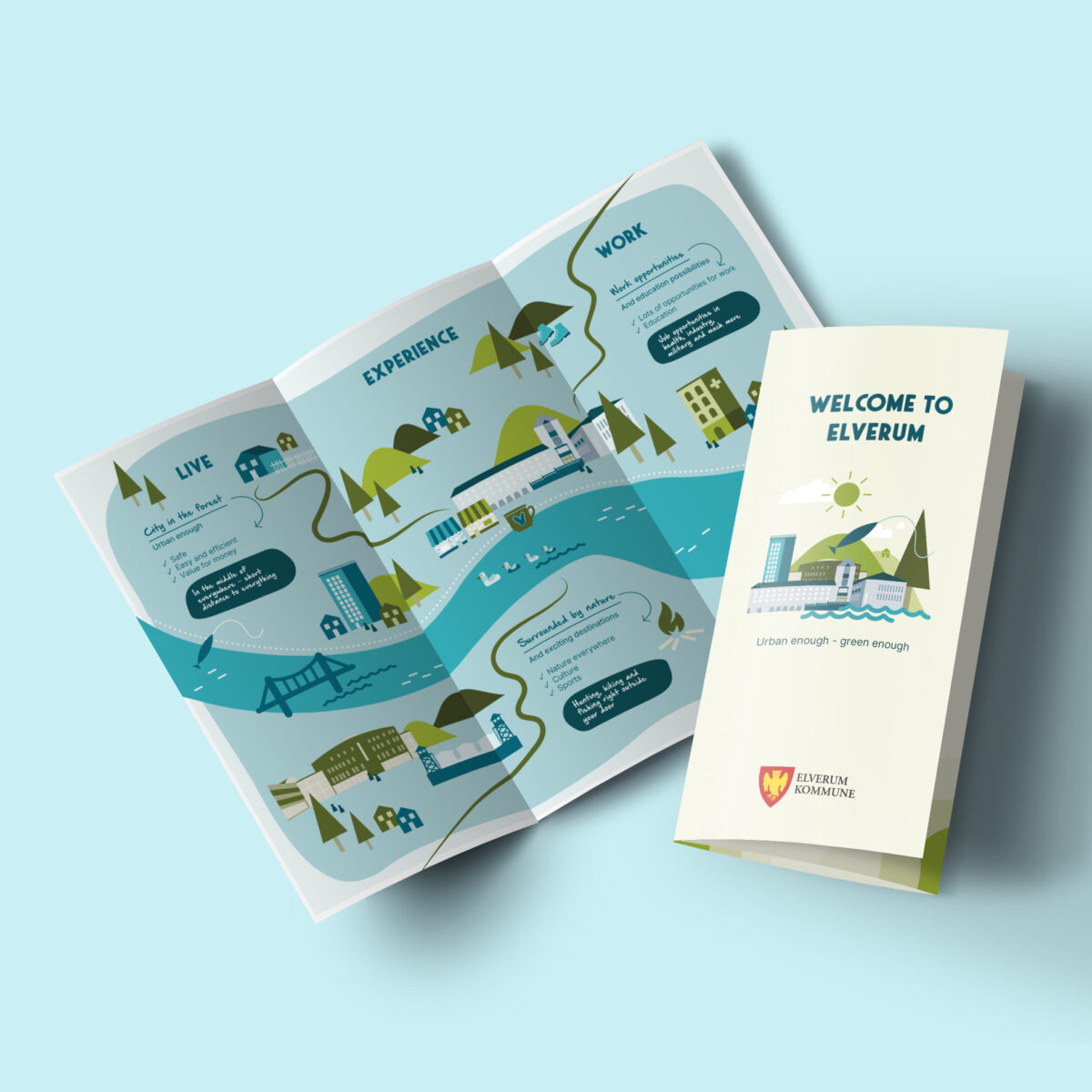
In this illustration and design project for Elverum Vekst, the goal was to highlight Elverum as an attractive place to live, experience, and work—specifically targeting an international audience at a trade fair in the Netherlands. To achieve this, I designed a range of visual materials created to both inform and engage.

The project included an illustrated map of Elverum, designed to highlight residential areas, workplaces, and local attractions. Each category: Live, Experience and Work was marked with distinct illustrations to ensure clear navigation and easy understanding. The map was integrated into a brochure distributed at the trade fair.

I also developed a roll-up banner and a T-shirt featuring an illustration that complements the rest of the visual materials.

The materials were tailored to present Elverum as an appealing choice for an international audience, clearly communicating the city’s many opportunities for a rich and balanced life.
PATTERN DESIGN FOR CURTAINS AT MOELVEN

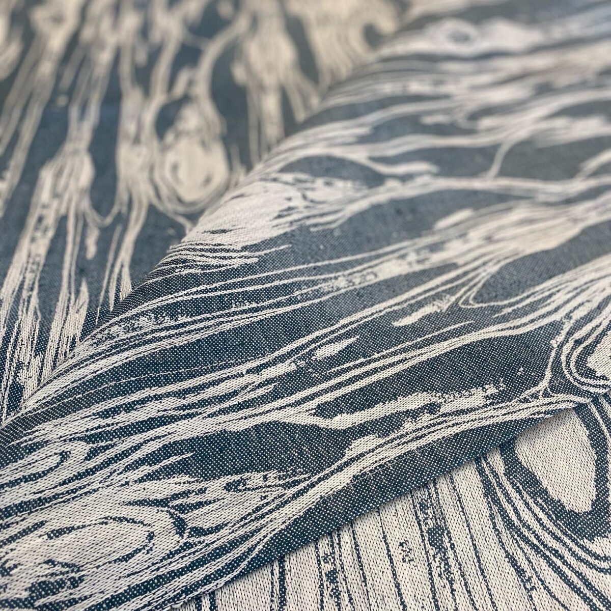
In collaboration with Fugleperspektivet Interior Architects, I had the pleasure of designing custom-made curtains for Moelven’s reception and office spaces at Østerdalsbruket. The project focused on reflecting Moelven’s identity as a leading player in the Scandinavian timber industry. The pattern is inspired by the natural lines of wood grain and executed in the company’s brand color to strengthen brand recognition.

The design process began with analog methods; I used paint, brush, paper, and pen to create an organic and authentic expression that truly represents Moelven’s nature-based identity. The curtains are produced in linen, a natural material that resonates with Moelven’s sustainability values, and were woven at a linen mill in Sweden.

This project demonstrates not only a strong connection between functional and aesthetic design, but also how thoughtful interior design can help strengthen a company’s overall brand strategy.

PATTERN AND ILLUSTRATION - SNOWMAN

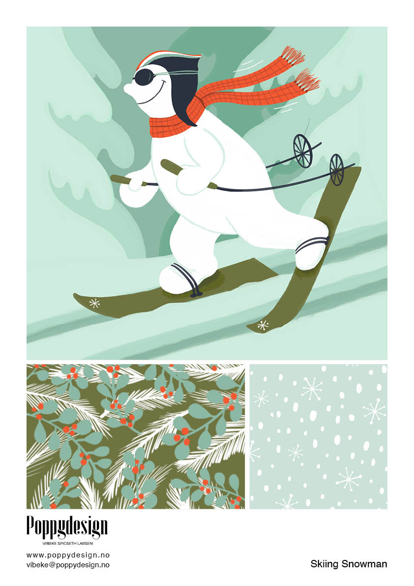
This mini collection was designed around a selected color palette and concept. The process began with hand-drawn sketches in my sketchbook. I eventually chose a snowman motif and concept to develop further.

The sketch was further developed and drawn in Procreate. The snowman was created in multiple layers, making it easy to adjust colors and other details.

Once the main illustration was completed, I began sketching patterns that could complement and further develop the theme.

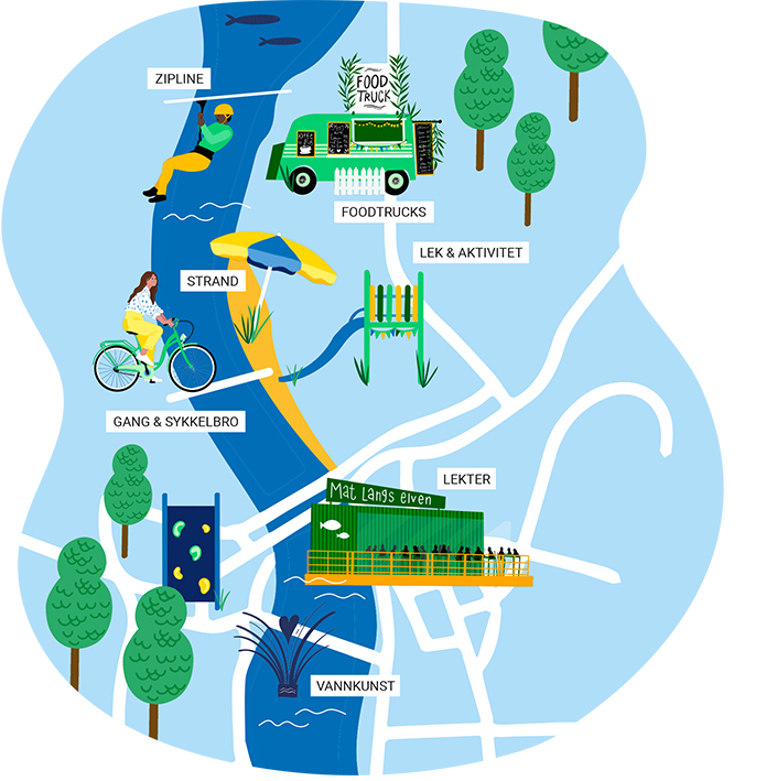
MAP AND ILLUSTRATIONS FOR ELVERUM HØYRE

The assignment involved designing an illustrated map of Elverum, along with supporting illustrations, to visually communicate the city’s opportunities for development and to highlight how Elverum is, and can continue to be, a safe place to live, grow up, work, and thrive.

The first phase of the project involved a brainstorming session where Elverum Høyre presented their ideas. I then developed an initial sketch, which we refined together until we arrived at the right visual expression.

In addition to the map, I created a series of standalone illustrations used in Elverum Høyre’s election program to further support and reinforce the message.

The map and illustrations were also used across various marketing materials, including roll-up banners, posters, tote bags, and T-shirts.

Marketing materials for Facebook and the website were also developed, in line with Høyre’s visual identity and brand guidelines.