PATTERN DESIGN FOR CRAFT SUPPLIES

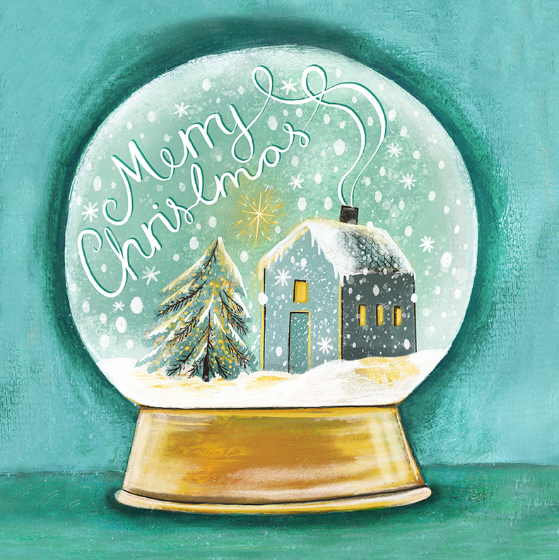
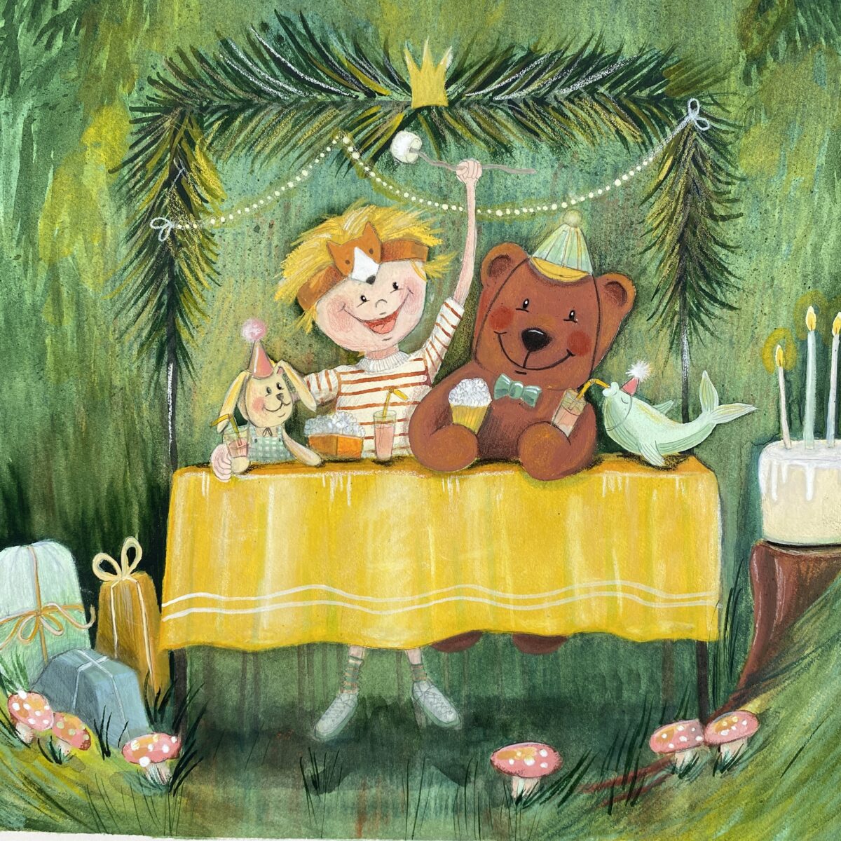
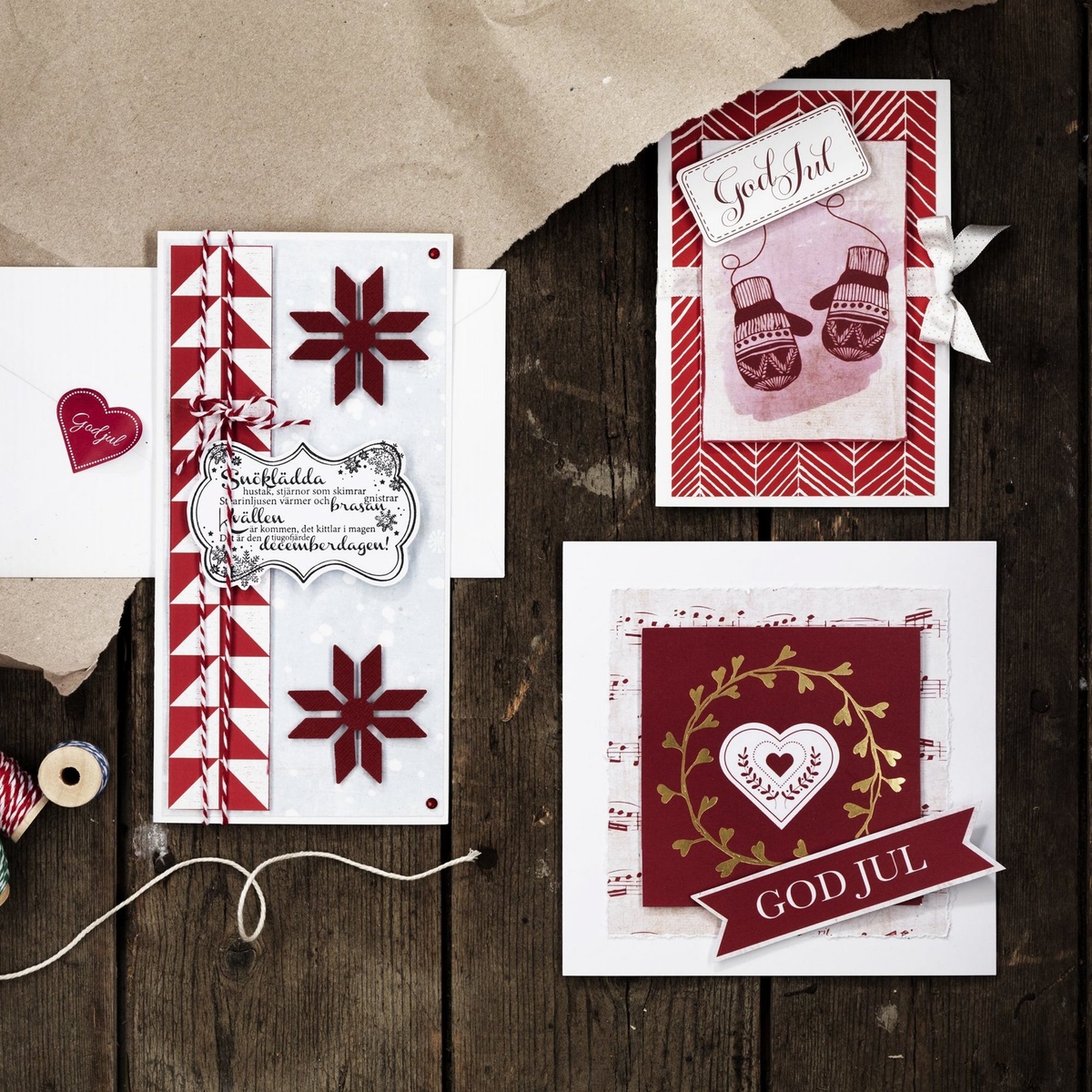
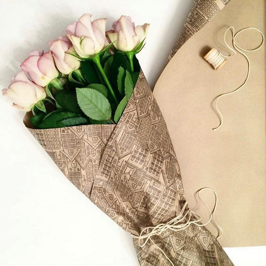
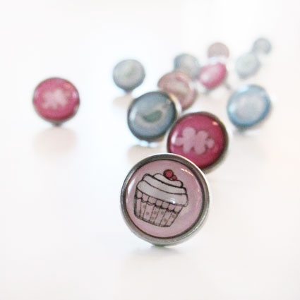
I've had the pleasure of working with Panduro Hobby over a long period of time, where I have illustrated and designed a varied range of their products for scrapbooking and card making. These products were part of larger, coordinated series that included stickers, paper, washi tape and other embellishments.

I have been responsible for everything from concept development, color pallettes to the design of the product itself. I also designed the packaging for the products. I have ensured that each element harmonizes with the other products in the series, which constitute inspiring products for hobby enthusiasts.

My projects for Panduro Hobby are a good example of how I combine my passion for detailed illustration with functional and aesthetic design. I see the great importance of creating products that are not only visually appealing, but also practical and user-friendly. Through this collaboration, I have been given the opportunity to develop creative and colorful solutions that inspire customers all over Scandinavia.

ILLUSTRATIONS FOR CRAFT SUPPLIES

I've had the pleasure of working with Panduro Hobby over a long period of time, where I have illustrated and designed a varied range of their products for paper crafts, scrapbooking and card making. The products were designed in large collections that included stickers, clearstamps, papers, washi tape and other embellishments.

I have been responsible for everything from concept development, color pallettes to the design of the product itself. I also designed the packaging for the products. I have ensured that each element harmonizes with the other products in the series, which constitute inspiring products for hobby enthusiasts.

Here I show a selection of products designed for Panduro Hobby. The products are good examples of how I combine detailed illustrations with colors and overall designs. I emphasizes the great importance to creating products that are not only visually appealing, but also practical and user-friendly. Through this collaboration, I have been given the opportunity to develop many creative and colorful collections that inspire people to craft and be creative!

ILLUSTRATIONS AND JOURNAL ACCESSORIES

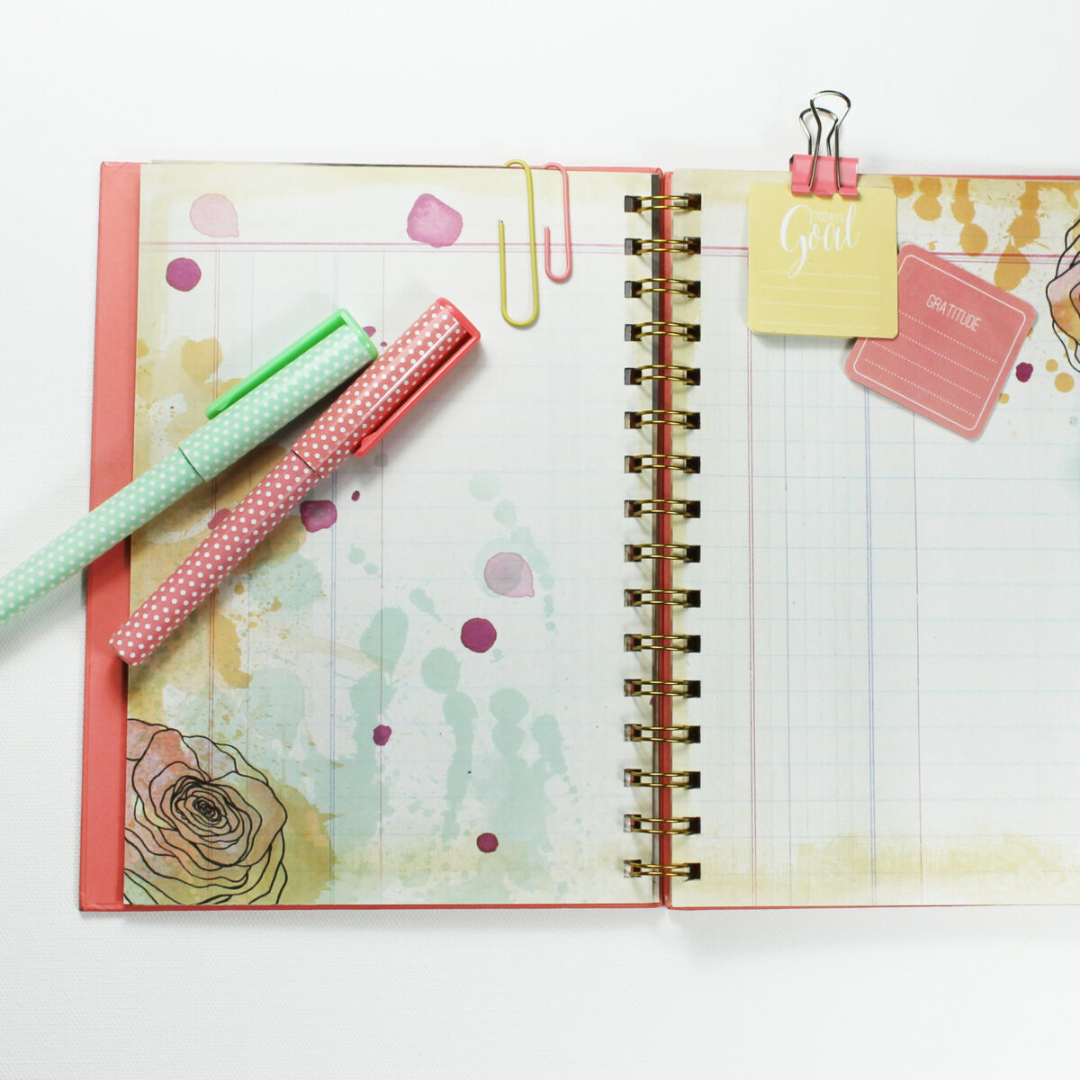
I've had the pleasure of working with Panduro Hobby over a longer period, where I have, among other things, illustrated and designed a selection of their creative journals. These journals, often part of larger series, included coordinating stickers, paper, washi tape, and pens. The design process consisted everything from the design it self, to color selection and packaging design. These projects are examples of various journals and accessories I have designed for the client.

ILLUSTRATION FOR BOOK COVER

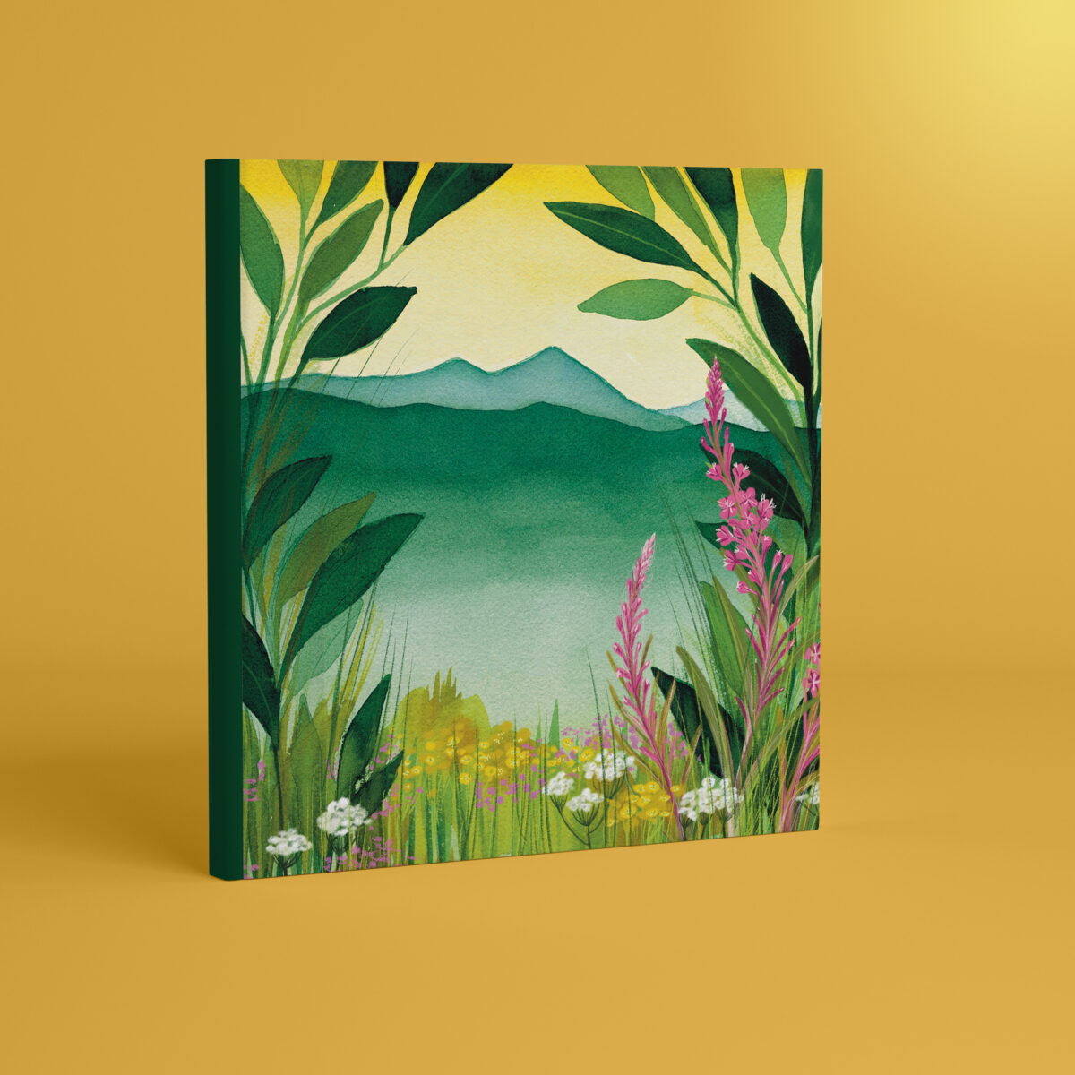
I had the pleasure of working with Fjellflyt on a book cover for a planner, inspired by nature and its calming influence. The project, called "Book Temptation", was an exciting opportunity to combine my colorful art with nature.

Fjellflyt wanted a cover that captured the feeling of longing for the mountains. Their specific wishes included a colorful drawing with elements such as mountain flora, and colors that reflects the clear mountain water. I used the colors from the plants gorse, goitrams, and other fantasy flowers and leaves to create a harmonious and calm illustration.

I used a combination of gouache and watercolor paint on paper, as well as Procreate, to achieve the desired result. After a few conversations and feedback from the client, I fine-tuned the design to ensure it matched their vision. The final book cover was a nice combination of nature's calm and energetic colours.

Buy your "book temptation" in Their webshop.

ILLUSTRASTIONS FOR ENAMEL MUGS

As a freelance illustrator and graphic designer, I was commissioned to design illustrations for Tanum Bokhandel's enamel cups. This assignment was part of a merchandise series that was sold in Tanum's stores in Oslo and at their locations at Norwegian airports.

The aim of the design was to capture the essence of local culture and identity through visual expression. Each illustration includes elements and dialect expressions that emphasize the uniqueness of each location, so that each cup served not only as a utility object, but also as a memory of the place it represents.

In addition, a small series of enamel mugs was developed and sold at Christmas.

LITTLE GARDENER PATTERN DESIGN

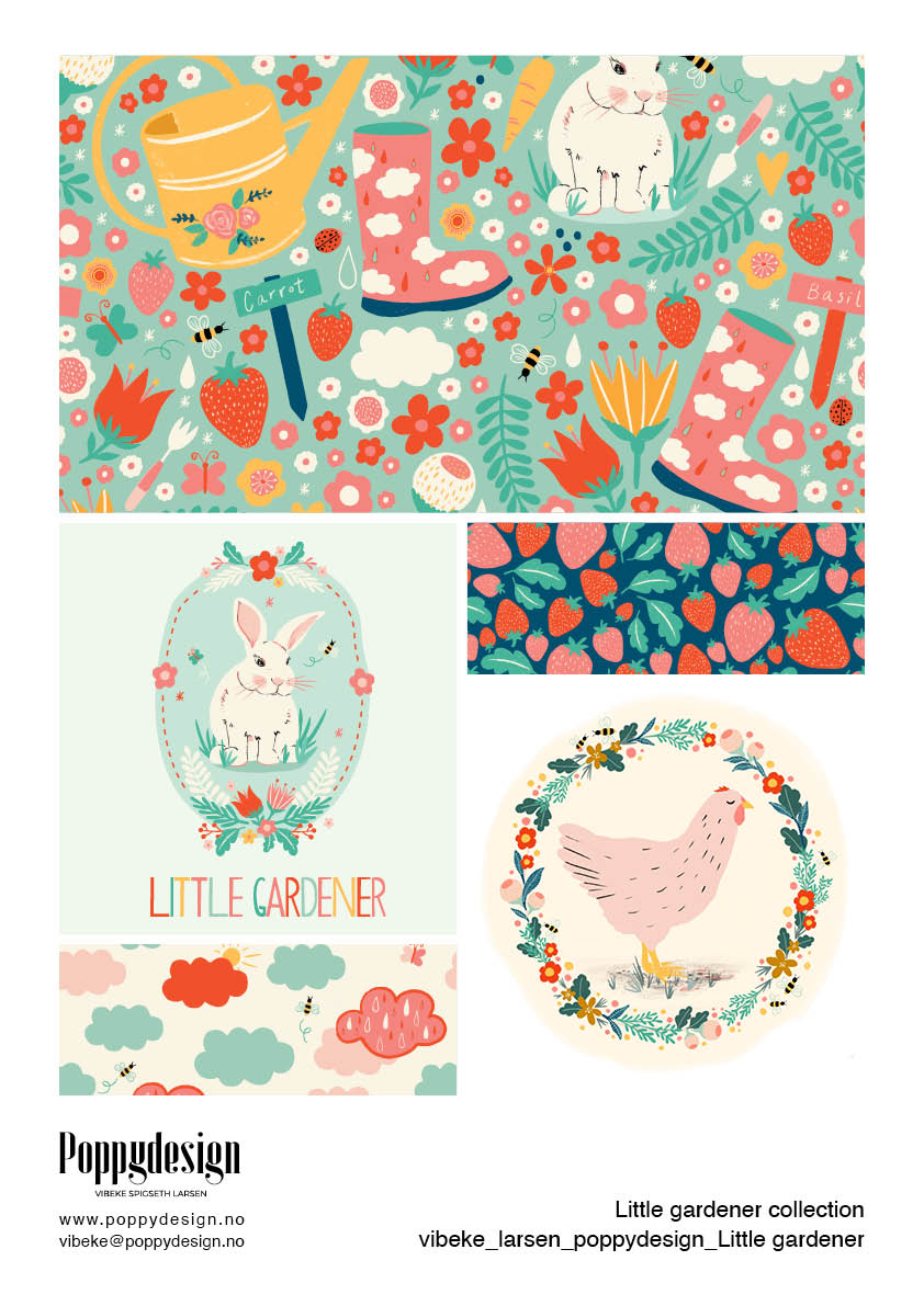
The "Little Gardener" collection is designed with children and the joy of gardening in mind. This project combines colorful garden and nature elements such as flowers, strawberries, animals, and clouds, all in a playful style. The clouds featuring the word "grow" as an educational element encourage children to think about growth and nature.

The color palette is bright and playful, with a mix of pastels and more bold colors that makes the designs perfect for children's clothing and other kid-friendly products. This makes the patterns ideal for a range of products, from clothes to accessories like gardening tools, backpacks, small bags, or notebooks.

"Little Gardener" is available for licensing or full buyout.

ILLUSTRATIONS FOR TOTEBAGS - MAUDS MANUFAKTUR

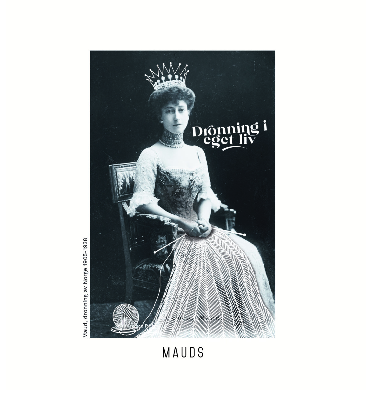
In this project, I have had the pleasure of working with Mauds Manufaktur to create a series of unique project bags with illustrations based on historical photographs of Queen Maud. Each bag has photographs of Queen Maud, to which I have added the text "queen in your own life" and elements of knitting. The illustrations tie together her historical significance with the art of needlework.

The illustrations are designed with a hand-drawn and artistic approach, where the knitting elements are integrated seamlessly into the photographs.

Available in two sizes, the totes are not only practical for all kinds of knitting projects and storage of needlework equipment, but also as a stylish accessory.

Also take a look at branding and B2B webshop design for Mauds Manufakturr

RENDERING OF LOGO FOR FRIHEST

In this project, I have had the pleasure of working with Matilde Brandt in Frihest to draw and further develop a logo, based on her original sketches. The logo's design has been carefully crafted to reflect her approach and philosophy around freedom dressage and intuitive communication with horses.

The logo's graphic expression combines the elegance and strength of a horse with sensitive and flowing lines, which symbolizes freedom and harmony between horse and rider. "Frihest" is integrated in a way that balances visually with the logo element, and creates a clear and recognizable identity for Matilde's business.

The goal of the design process was to create a logo that both reflects Frihest's commitment to the horse's welfare and their unique approach to training. The result is a visual identity that communicates values ​​of trust, respect and playful learning in working with horses.

ILLUSTRATIONS FOR THE ELVERUM BOARD GAME

For the Elverum board game, I have had the pleasure of illustrating a unique game board that represents the city's culture and business life. In this project, I have combined traditional watercolor techniques with modern digital drawing in Procreate, which has resulted in a colorful and detailed map of Elverum. In addition to the map itself, the game board also has illustrations of landmarks, elements and buildings that characterize the city.

The Elverum game follows a Monopoly-like model, where players can buy shares in local businesses. This promotes the city's businesses, and also contributes to a unique gaming experience that is directly linked to Elverum. The game is available for purchase at Elverum Turn.

This project is part of a larger initiative where local illustrators and artists are engaged to design game boards for different cities and local businesses are encouraged to buy space on the game board, with the aim of supporting local activities for children and teenagers through the sale of the games.

MAP & FOLDER FOR ELVERUM VEKST

In this illustration and design project for Elverum Vekst, the goal was to highlight Elverum as an attractive city to live, experience and work in, especially aimed at an international audience at a fair in the Netherlands. To achieve this goal, I designed a range of visual material that both informs and engages.

The project included an illustration of a map of Elverum, designed to focus on the city's residential areas, workplaces and attractions. Each category: Live, Experience and Work were marked with various illustrations for easy navigation and understanding. The map was integrated into a leaflet that was distributed at the fair.

I also developed a roll-up and T-shirt with an illustration that complements the other material.

The material is tailored to make Elverum an interesting choice for an international audience, with a clear message about the city's many possibilities for a rich and balanced life.