VISUAL DESIGN AND WEBDESIGN

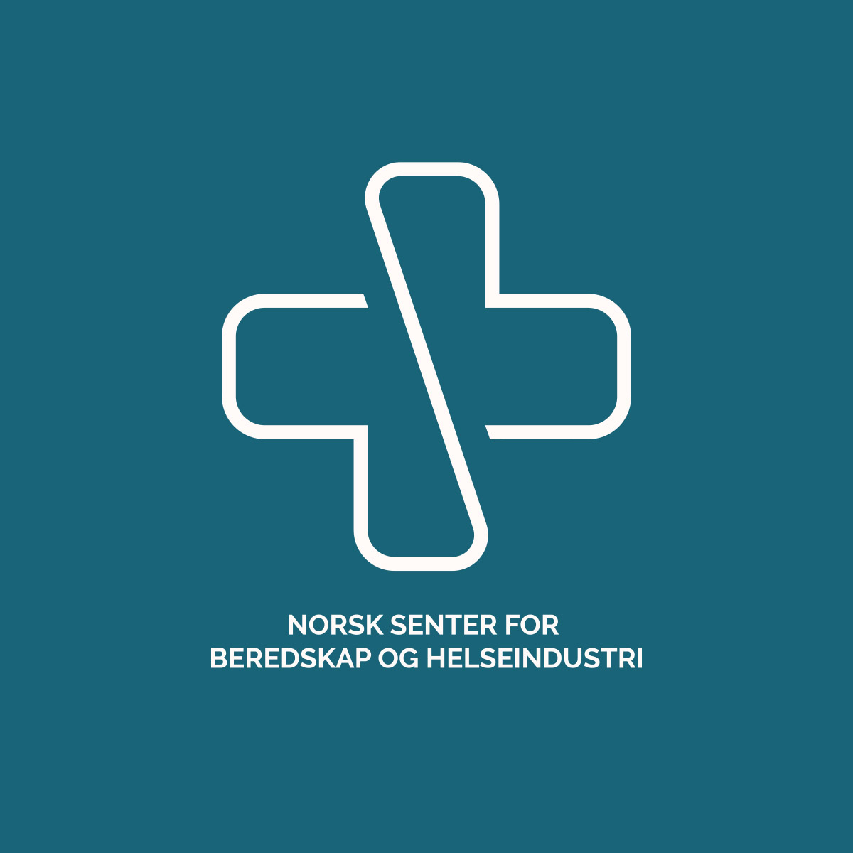
For the Norwegian Centre for Emergency Preparedness and Health Industry, I had the pleasure of developing the logo, color palette, and website.

The logo is carefully designed to symbolize the project’s core values. It combines a cross, representing emergency preparedness, with a heart symbolizing health. The form brings these elements together to illustrate how health and preparedness are interconnected, and how they form a strong foundation that must be built together for a safer future.

The project focuses on strengthening Norway’s ability to handle crisis situations by ensuring access to protective equipment and essential medicines—an increasingly important task in a world with vulnerable supply chains.

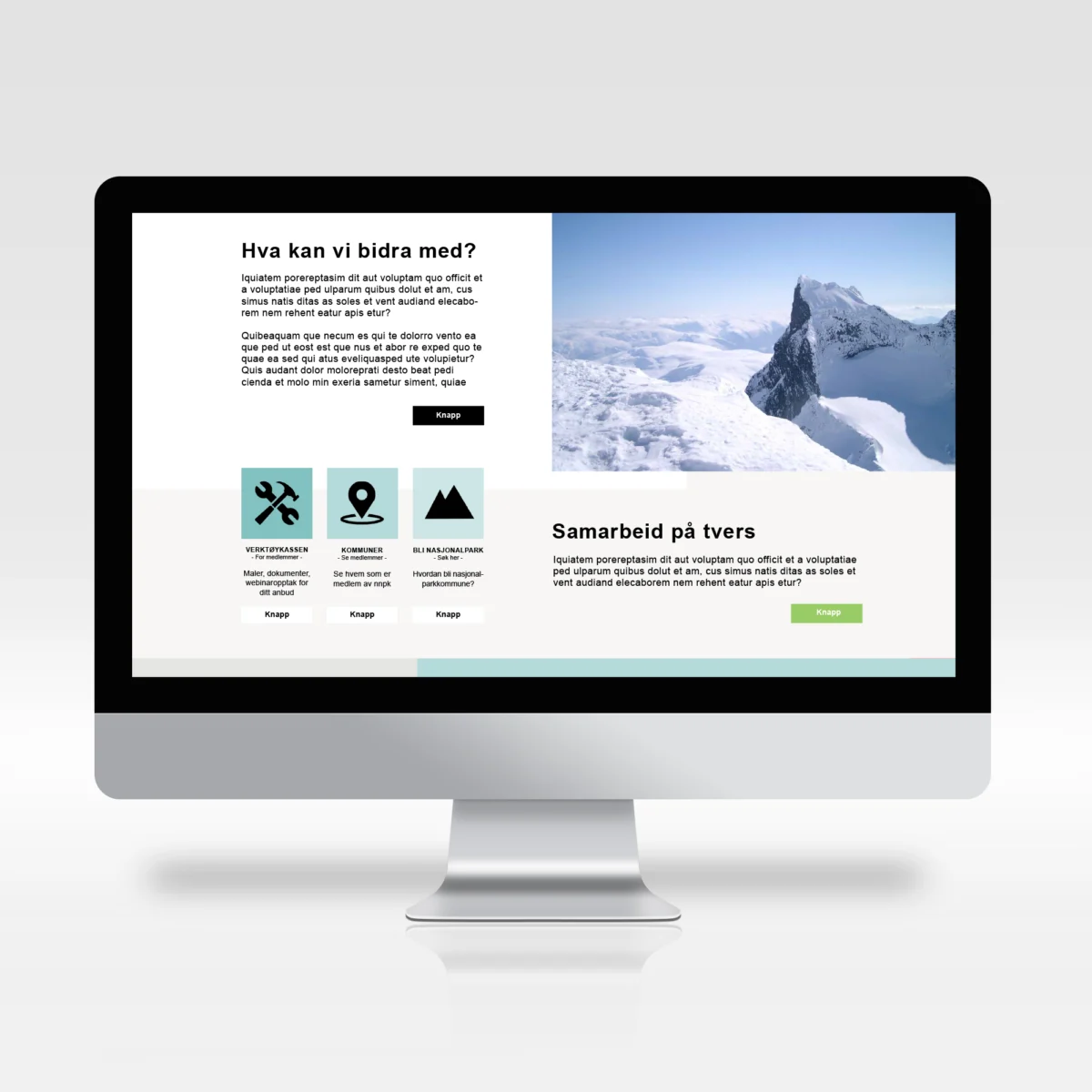
The website was created in collaboration with Siv Lillevik from Pixlweb, and together we created a solution that is both clear and informative. I’m proud to have contributed to such a meaningful project.

VISUAL DESIGN FOR AKUPUNKTØR CAROLINE HOLEN ULVÅKNIPPA

Caroline came to me with a simple sketch created by her daughter, with the wish to use it as a starting point for developing a cohesive visual identity for her acupuncture practice. The goal was to create a visual expression that reflects her work with balancing the body’s energy through acupuncture, with nature as a key source of inspiration.

The color palette is carefully curated to communicate calm, well-being, and natural energy. Light, earthy tones symbolize the healing and soothing effects of acupuncture, while green elements bring nature into the identity as a symbol of renewal, energy, and balance.

The logo and accompanying icons were designed with a focus on simplicity and elegance, with the acupuncture needle integrated into the name and the leaves symbolizing the flow of energy. Together, these elements create a harmonious visual identity that resonates with Caroline’s philosophy and gives her practice a professional and trustworthy expression.

The visual identity was developed with flexibility in mind, ensuring it works just as well digitally as in print, and giving Caroline a clear and recognizable presence across all channels.

SELECTED WEBSITE DESIGNS

This section of my portfolio presents a selection of web design projects where I was responsible for the visual design. Most of the websites were developed in collaboration with the development agency Pixlweb. This collaboration ensures that the websites are not only visually appealing, but also technically robust and fully functional.

My projects range from simple informational websites to complex e-commerce solutions, all designed with a focus on usability and effective brand building. I have experience creating responsive designs that enhance the user experience and strengthen a client’s digital presence.

LOGOS FOR VARIOUS CLIENTS

This page offers a brief overview of some of the logos I’ve designed. Each logo is created with a clear understanding of the brand’s needs and target audience, and reflects my ability to develop visual identities that are both aesthetically pleasing and strategically sound.

My projects span a variety of industries and include elements tailored to each client’s unique character, needs, and market. This selection highlights the range of my design expertise and my approach to logo design.

LABELS FOR BEER BOTTLES FOR SOBEER

For Sobeer microbrewery, I designed a series of labels tailored to three different beer styles as well as a cider. The goal was to create a visual system that clearly differentiates each product while maintaining a cohesive brand identity. Each label is designed to reflect the individual characteristics of the beverages: IPA, Weissbier, Lager, and Cider.

The typography balances modern and traditional elements, while the graphic crown placed above the name “Sobeer” enhances the sense of quality and creates a visual connection to the brewery’s location, craftsmanship, and taste.

WEBDESIGN FOR PIANOVERKSTEDET HOLTHE & BAKKE

Holthe og Bakke Piano Workshop is well known for its craftsmanship and expertise in piano repair and maintenance. Wanting to enhance their digital presence, they reached out to me to create a webshop that reflects their high quality and professional pride.

In collaboration with Siv in Pixlwebwe designed and developed a custom e-commerce solution for Pianoverkstedet Holthe og Bakke. The website integrates the company’s existing visual identity to ensure brand recognition and consistency. We implemented user-friendly features and custom filters, allowing customers to easily navigate a wide range of products by category, price, condition, and other relevant specifications.

The new webshop now functions as an extension of Pianoverkstedet Holthe og Bakke’s physical business. The website feels both professional and user-friendly, strengthening the brand’s reputation by offering an efficient and seamless online shopping experience.

Look at the webpage: www.pianoverkstedet.com

VISUAL IDENTITY FOR MAUDS MANUFAKTUR

In my collaboration with Mauds Manufaktur, I developed a visual profile that complements the brand’s existing logo. Mauds Manufaktur is a Norwegian brand specializing in knitting accessories. The new visual identity is inspired by Queen Maud and her historical and cultural significance, and reflects the core values of Mauds Manufaktur in a thoughtful and cohesive way.

The project included the development of a color palette reflecting the brand values of quality, inspiration, sophistication, and groundedness. The palette ranges from deep, earthy tones to lighter, more airy shades, coming together to create a balanced and appealing aesthetic.

As part of the visual identity, I also designed trade fair materials and Mauds Manufaktur’s B2B webshop. These elements were created to support the brand’s presence both digitally and in physical settings, ensuring a cohesive user experience across all touchpoints. The result positions Mauds Manufaktur as both modern and timeless, with a strong connection to its core values.

Take a look at the Illustrations made for Mauds Manufaktur

GRAPHIC DESIGN FOR TINKAFU

n my collaboration with Tinkafu, I had the opportunity to work broadly with graphic design and visual communication, aligned with the company’s visual identity and brand values. My responsibilities included the design of a wide range of graphic materials, such as product catalogs, trade fair materials, package inserts, website banners, and newsletter content.

In addition to these tasks, I also developed social media posts and animated GIFs to strengthen Tinkafu’s digital presence.

Each design element was carefully created to align with Tinkafu’s visual identity and to appeal to their target audience of young families looking for functional, long-lasting stroller accessories.

LOGO REFINEMENT FOR FRIHEST

In this project, I had the pleasure of working with Matilde Brandt of Frihest to refine and further develop a logo based on her original sketches. The final logo was carefully crafted to reflect her approach and philosophy of liberty training and intuitive communication with horses.

The logo’s visual expression combines the elegance and strength of a horse with soft, flowing lines, symbolizing freedom and harmony between horse and rider. The name “Frihest” is integrated in a way that visually balances the symbol, creating a clear and recognizable identity for Matilde’s business.

The aim of the design process was to create a logo that reflects Frihest’s dedication to horse welfare and their distinctive approach to training, resulting in an identity built on trust, respect, and playful learning.

WEBDESIGN FOR NORGES NASJONALPARKKOMMUNER

In this project, I designed a website for Norway’s National Park Municipalities, an organization focused on local value creation and business development through the brand Norwegian National Parks. The website serves as an important working tool as well as a presentation of the 24 national park municipalities and five national park villages, which together represent a vital part of Norway’s natural heritage and local economic development.

The website was designed in line with the association’s design guidelines, with a strong focus on usability. The visual expression reflects the organization’s professionalism while highlighting its close connection to the scenic landscapes of Norway’s national parks. My role in the project was to develop the visual design, while the technical development and implementation were handled by Pixlweb.

The aim of the design was to create an intuitive, informative user experience that showcases each municipality while supporting the association’s broader goals of local economic growth and community development through nature-based experiences.